

Choosing the
Right Colour Tiles
for Your Home
Choosing the right colour tiles for your home is more than just a matter of aesthetic preference; it's a crucial decision that impacts the atmosphere and functionality of your living spaces. Whether you're renovating a modern apartment or restoring a Victorian house, the colour of your tiles can either complement or clash with your architectural style.
In this guide, we’ll help you navigate through various colour schemes, taking into consideration the style of your property, the size and lighting of your space, and the overall design.

Choosing Tile Colours for Different Property Styles

Colour Schemes for Different Home Types
Firstly, consider the overall style and period of your property when selecting a tile colour scheme, ensuring that the tiles not only complement but also enhance the architectural character of your home.
For modern builds, which often feature open spaces and sleek lines, neutral colours like greys, whites, and blacks help to create a clean, minimalist look. These shades can be complemented with bold accent tiles in areas like the kitchen or bathroom to add contemporary flair.
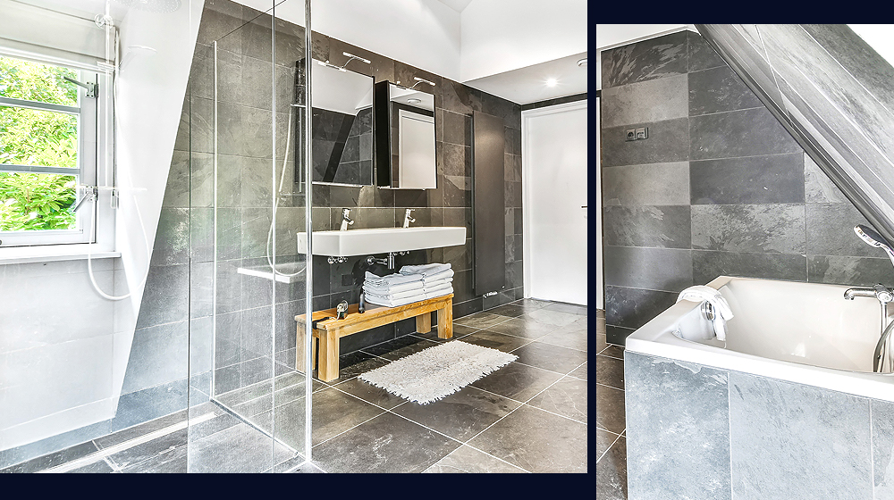
On the other hand, Victorian properties, with their intricate mouldings and detailed craftsmanship, suit richer, deeper colours. Traditional choices include terracotta, deep greens, or navy, which highlight the period features and craftsmanship of the rooms. Glossy finishes on these tiles can also help to reflect light, enhancing the ornate details.
For homes with a rustic or country style, natural stone colours or warm earth tones like beige, ochre, and sienna work beautifully. These shades evoke a cosy, welcoming atmosphere and match well with natural materials like wood and stone.
Matching Tiles to Architectural Elements
Matching tiles to the unique architectural elements of your home is an important part of creating a harmonious interior. To do this effectively, consider the era and distinctive features of your property.
For instance, if your home has a traditional Victorian layout with high ceilings and ornate mouldings, selecting intricately patterned tiles Victorian floor tiles can amplify its historical character. Opt for tiles with a matte finish and softer, muted colours to maintain the authenticity of the space.
For more contemporary homes, which often feature clean lines and open floor plans, look for tiles with a minimalist design. Large-format tiles in monochromatic shades or subtle textures can enhance the modern feel while making the space appear larger and more cohesive.
In homes that blend indoor and outdoor living, such as those with patios or extensive gardens, consider using tiles that transition smoothly from inside to outside. Materials that mimic natural elements like stone or wood work well for this, helping to blur the boundaries and extend the living space visually.

Choosing Tile Colours for Your Space
Consider the Size and Shape of the Room
The size and shape of a room also play a role in selecting the appropriate tile colours and shapes. Whether you’re looking to create a feeling of expansiveness in a compact area or aiming to add character to a vast space, a thoughtful selection of tiles can significantly influence the outcome.
For smaller spaces, lighter colours such as creams, beiges, or light greys can make the area feel more open and airy. Using larger tiles in a small room can also create the illusion of more space, as fewer grout lines lead to a cleaner visual flow.
Conversely, in larger rooms, you have the flexibility to experiment with darker or more vibrant colours without overwhelming the space. Large rooms can also handle more intricate patterns or a combination of tile sizes that can help define different areas within the same space.
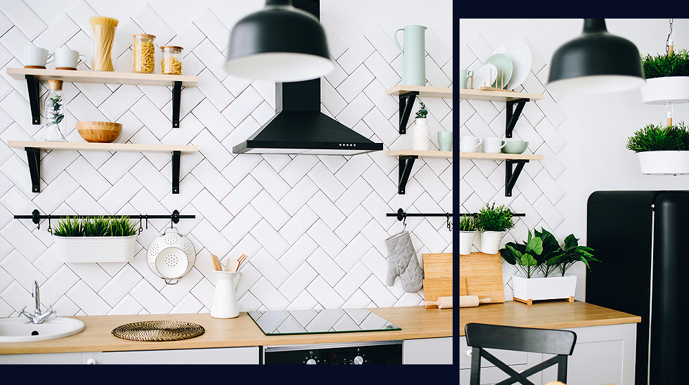
When considering the shape of the tiles, rectangular metro tiles laid in a herringbone or staggered pattern can add depth and interest to a room. For elongated rooms, placing tiles diagonally can help balance the proportions, making the room appear more square.
Colours to Match Design and Focal Points
Tiles can be used to highlight key design elements and focal points, drawing attention and adding character while resonating with the style and feel of the space.
If your room has a natural focal point, such as a fireplace or a large window with a stunning view, consider using contrasting tile colours or intricate patterns around these features to frame and accentuate them. For instance, a dark, textured tile can make a white mantelpiece stand out, or glossy, reflective tiles can enhance the light coming through a large window.
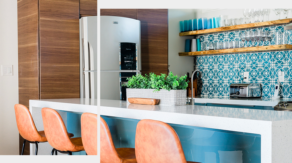
For rooms lacking a natural focal point, you can create one with tiles. A vibrant backsplash in the kitchen, a patterned tile wall in the shower, or a colourful mosaic in the hallway can serve as striking visual elements that capture attention and define the room’s ambience.
Additionally, consider the scale and proportion of the tiles in relation to the room’s size and the focal point. Large-format tiles can give a sleek, modern look, while smaller, decorative tiles might suit a more detailed, artisanal approach.

Choosing Tiles Colours for Your Lighting
Tiles for Natural Light
Tiles with glossy finishes or made from materials like ceramic and porcelain tend to reflect natural light, brightening the space and making it appear more open and airy. Light-coloured tiles, such as whites or pastels, amplify this effect, maximising the illumination in rooms that receive ample sunlight.
Conversely, darker tiles or those with a matte finish absorb more light, which can create a cosier, more subdued atmosphere. This can be ideal for spaces designed for relaxation, such as bathrooms and bedrooms, where a softer ambience is desired.
Also, consider the room's orientation and the amount of daylight it receives. North-facing rooms might benefit from lighter, reflective tiles to make the most of the limited light, while south-facing spaces can handle darker hues without feeling too enclosed.
Tiles for Artificial Light
Artificial lighting, depending on its intensity and colour temperature, can alter the appearance of tile colours. Choosing tiles that complement artificial lighting is just as important as considering natural light, as it ensures your space remains appealing and functional after dark.
For spaces that rely heavily on artificial lighting, like bathrooms and kitchens without much natural light, consider tiles with a slight gloss or glaze. These surfaces can help reflect light, enhancing the overall brightness and making the area feel larger. On the other hand, tiles in matte finishes can be ideal for areas with strong artificial lighting, as they reduce glare and maintain a more consistent colour perception.
Pay attention to the colour temperature of the lighting as well. Warm lighting can bring out the richness and depth of earthy tile colours, such as creams and browns, making a space feel welcoming and cosy. Cooler lighting works well with greys, blues, and whites, enhancing modern and minimalist aesthetics.
Experimenting with different types of lighting on tile samples in the intended environment is a practical approach, allowing you to see firsthand how the lighting will interact with your tile choices under various conditions.
Choosing Tile Colours for Your Decor Style and “Vibe”
Set the Mood with Colour
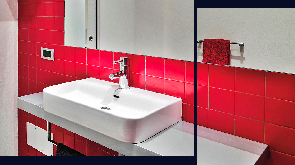
The colours you choose for your tiles help set the mood and atmosphere of a room. Warm colours like reds, oranges, and yellows bring energy and vibrancy, making them ideal for social spaces like kitchens and dining areas where you want to stimulate conversation and activity.
Cool colours such as blues, greens, and violets, on the other hand, tend to have a calming effect. They are excellent choices for bathrooms and bedrooms where relaxation and tranquillity are the goals. These colours can help create a serene escape from the hustle and bustle of daily life.
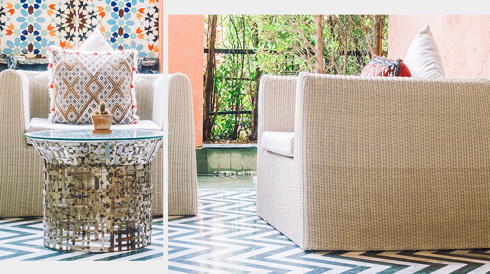
Neutral colours, including beiges, greys, and whites, offer versatility and can be soothing or grounding depending on their context and how they're used. They work well in almost any space, providing a backdrop that allows other design elements to stand out or blend harmoniously.
Using tiles of different shades within these colour families can add depth and interest to a room, further enhancing the desired mood. For example, layering lighter and darker shades of blue can create a more nuanced, restful environment.
Make a Statement with Contrasting Colours
Using contrasting colours can dynamically enhance the visual appeal of a space. One effective strategy is to use bold, contrasting colours as accent tiles within a more neutral scheme. For instance, vibrant blues or greens can pop against a backdrop of white or grey, drawing the eye and adding depth.
Another approach is to employ contrasting grout colours. A dark grout with light-coloured tiles, or vice versa, outlines each tile distinctly, creating a striking grid pattern that can visually expand the space.
To make a bolder statement, consider using complementary colours—those opposite each other on the colour wheel. This could mean pairing warm orange tiles with cool blue accents in a bathroom to energise the space, or soft yellows with deep purples in a kitchen for a touch of elegance.
Achieve a Peaceful Balance with Neutral Colours
Neutral tiles provide a timeless appeal, easily adapting to various decor styles and personal tastes. This versatility makes them an excellent long-term investment, as they can seamlessly accommodate future changes in decor without clashing or requiring replacement.
Additionally, neutral colours such as beige, grey, and cream create a calming atmosphere, making spaces feel more open and airy, and overall more relaxing. They are particularly beneficial in smaller rooms or areas with limited natural light, where darker colours might make the space feel cramped or oppressive.
Neutral tiles also serve as a perfect backdrop for highlighting other design elements, such as colourful artwork, furniture, or vibrant accent pieces, allowing these features to stand out without overwhelming the senses. This balance of subtlety and support makes neutral-coloured tiles a wise choice for creating a peaceful, adaptable home environment.
Find The Right Tiles for Your Home with Target Tiles
Choosing the right colour tiles for your home is crucial to creating a harmonious and aesthetically pleasing environment. By considering the architectural style of your property, the size and lighting of your space, and your overall design preferences, you can make informed decisions that enhance the functionality and beauty of your living areas.
Explore our extensive collection to find the perfect tiles that match your vision. Our diverse range of colours and styles ensures you will find the ideal tiles to complement your home!


